bilityBuddy
Project Scope
August 2020 - February 2021
Role
UI Designer, UX Researcher, Usability Tester
Tools
Figma, Illustrator, Balsamiq, Mural, Miro, Draw.io, Google Forms, Google Slides, and Zoom
Overview
bilityBuddy is an iOS app inspired by my grievances with getting to the gym, poorly planned group events, and overall urge to interact with like-minded people that can hold me accountable.
bilityBuddy is an iOS app inspired by my grievances with getting to the gym, poorly planned group events, and overall urge to interact with like-minded people that can hold me accountable.
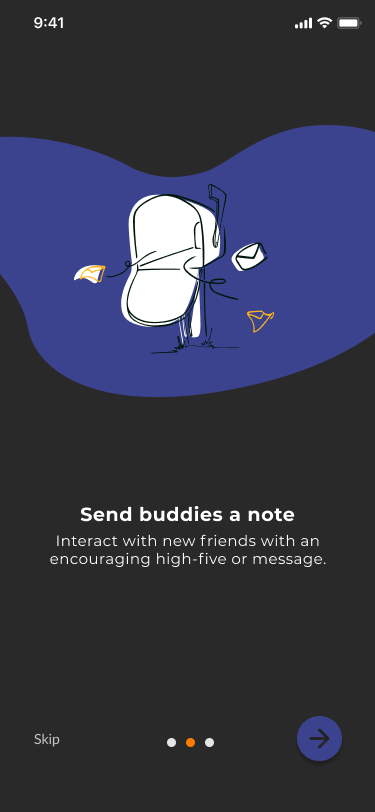
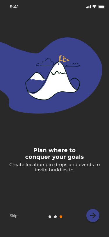
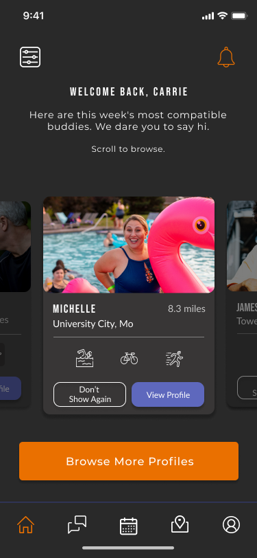
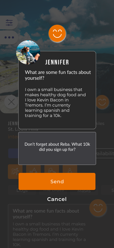
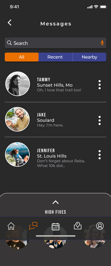
With this in mind, bilityBuddy provides a space for people 18+ to find fitness friends with a variety of backgrounds, interests, and abilities to hold each other accountable. Here, you can send a high-five or message to interact, create location pins, send invitations for stress-free planning, and be each other's cheerleader.
The Name
accountabilityBuddy
It boils down to accountability. With each other's help, we can stick to commitments and transform effort into results; while having a cheerleader along the way.
Problem
There isn’t an app connecting people that work out, or intend to, that encourages interactions for accountability, supportive goal tracking, and overall positive mental and physical health.
There isn’t an app connecting people that work out, or intend to, that encourages interactions for accountability, supportive goal tracking, and overall positive mental and physical health.
By setting “accountability appointments” a person is more likely to succeed so users of all ages must be able to access the interface easily to plan a meetup that feels safe and reliable.
Challenge
Create a social app where there is no swiping interaction and eliminate gamification. To provide a platform that doesn’t rely on superficial connections and provides a safe environment.
Create a social app where there is no swiping interaction and eliminate gamification. To provide a platform that doesn’t rely on superficial connections and provides a safe environment.
DESIGN PROCESS
UX Methods Used
Empathize: User Interviews, Survey, Competitive Analysis
Define: User Personas, Empathy Maps
Ideate: POV/HMW, Sketches, User Flows, Sitemap
Build: Wireframes, Prototype
Test: Usability Testing
EMPATHIZE
User Interviews
To better understand the problem, I conducted three interviews through zoom. Each person had different experiences with physical activity in their life and varied in age. The interviews included topics to get to the core of how physical activities play a role in their life and how they interact with others.
Some questions included
Some questions included
- How would you define the word “workout”?
- What is the most important aspect for you to achieve in a workout?
(speed, the accuracy of skill achieved, time spent in the activity)
- How important is accountability for you in exercising?
- What kind of platform do you find helpful to reach a successful
workout, virtual or in-person?
- Can you please explain the type of person you enjoy working out
with?
Patterns
- Enjoy exercising outside.
- Likes friends that are good listeners and can carry on a conversation.
- All were open-minded in trying a new activity.
- All felt being tired and happy defined a successful workout.
“Nice to be outside”
“Spend too much inside these days”
“Into the fire approach”
“At least burned some calories so I can continue to eat badly”
Survey
With the help of Google Forms, I created a two-part survey. The question styles used were screener, multiple-choice, linear 5-point scale, and one open-ended. The link to the survey was shared on social media and my school’s community Slack channel. Thirty-seven people participated. Participants included men and women ranging from 18 to 55+ years old.
Goals
1. To understand if potential users practice an active lifestyle and if accountability is helpful.
2. To understand how comfortable people are with meeting new people and how they view planning interactions.
3. To explore their experiences on rating systems and if I should include one as a feature.
2. To understand how comfortable people are with meeting new people and how they view planning interactions.
3. To explore their experiences on rating systems and if I should include one as a feature.
Findings
Over half of the contributors include physical activity in their life and find accountability important to their success. Also, even though many participants found planning with others to be frustrating, it doesn’t stop them from being eager to meet new people. However, a large portion of the participants were women so I want to expand my survey to collect more data from men to see if the results would vary.
65.5% of participants find rating systems beneficial and the same amount of people act based on a rating. A rating/review feature will encourage users to interact, bring peace of mind, and encourage safe meetings.
65.5% of participants find rating systems beneficial and the same amount of people act based on a rating. A rating/review feature will encourage users to interact, bring peace of mind, and encourage safe meetings.
Competitive Analysis
Overview
I chose four apps and one website that are indirect competitors. These are fitness or social related with a similar target audience.
Findings
- only one had an option to sign up or login
with telephone number
with telephone number
- you had to enable or manually add a
location
location
- everyone was trying to make a buck
- the help icon or center wasn't obvious
- no option to review an experience
DEFINE
User Personas
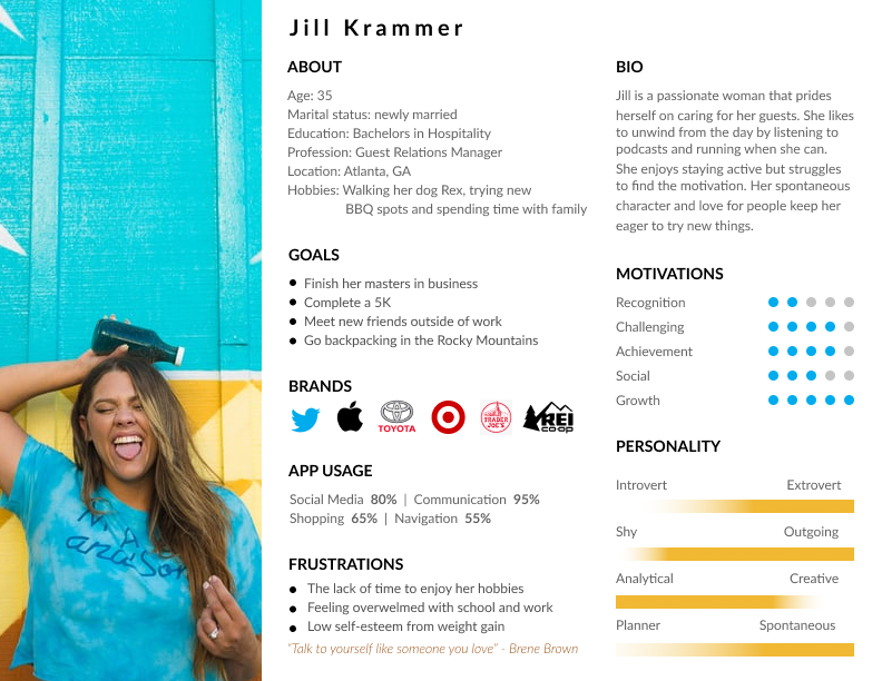
With the data collected from interviews, I created personas to express the targeted users. These personas show that all ages with varying health objectives can find bilityBuddy beneficial.

Empathy Maps
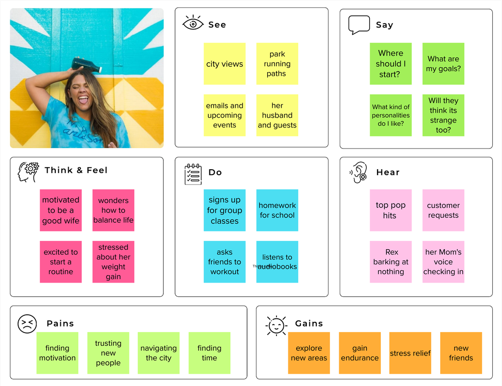
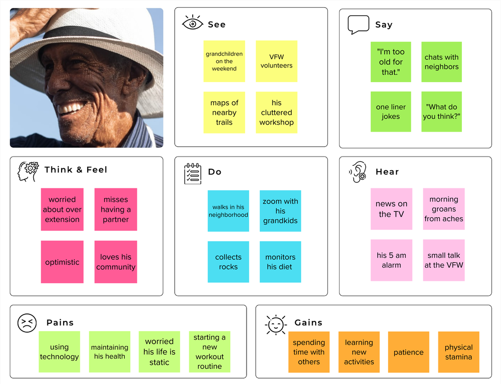
Next, I created an empathy map for each persona to better understand the user, uncover their needs, find clarity in what drives the user's behaviors, and find similarities among the users.
IDEATE
Defining a Problem
Now that I had a feel for who my target audience was, I decided to dive deeper into the insights I discovered, their needs, their perspective and pivoted to the how might we approach. This helped me organize the problems so I could pinpoint the challenges and turn them into solutions.
Send a message.
Drop a pin.
User Flows
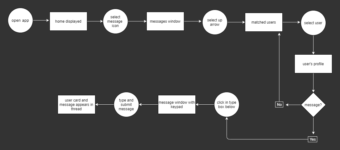
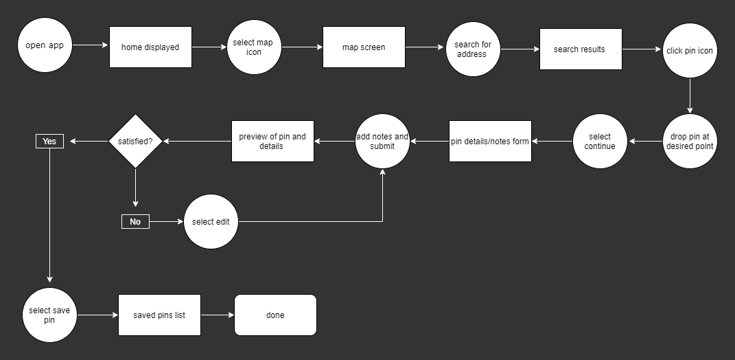
After gathering data from potential users and developing an understanding of my targeted users it came time to ask myself, how are they going to interact with the app. Using a flow chart, I designed the direction a user could navigate and the ways, if any, they could be presented to go of course. This helped me to analyze the app's features and the decisions a user could face.
Information Architecture
I used a sitemap to have a visual guide for my navigation tab. Creating a road map helped me determine if my app was becoming unmanageable. This tool helped me to stay on track by identifying what has yet to be completed.
Sketches
Next, with the help of my user flows to guide me, I started to sketch. These sketches helped navigate the story of my product and create seamless user flows through design. They were helpful to reference when designing my digital wireframes.
BUILD
Wireframes
Low-Fidelity
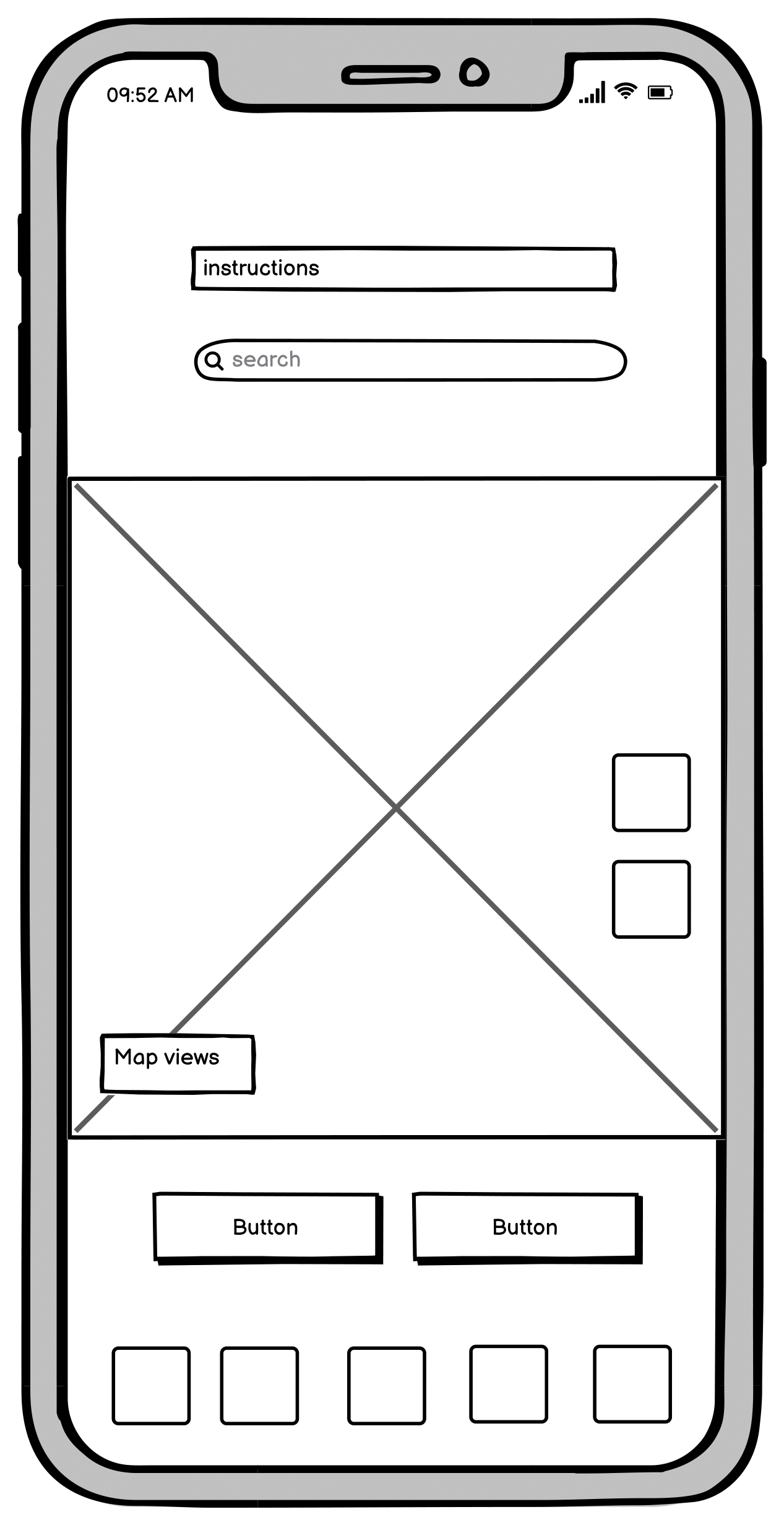
After sketching, I moved my design to wireframes to begin nailing in the desired components.

Home page
Map home
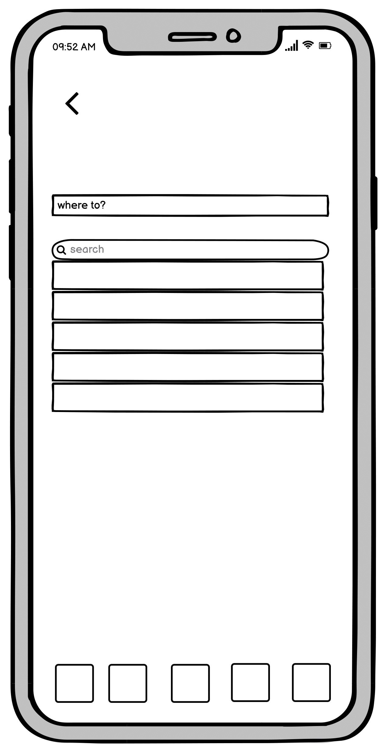
Search drop down
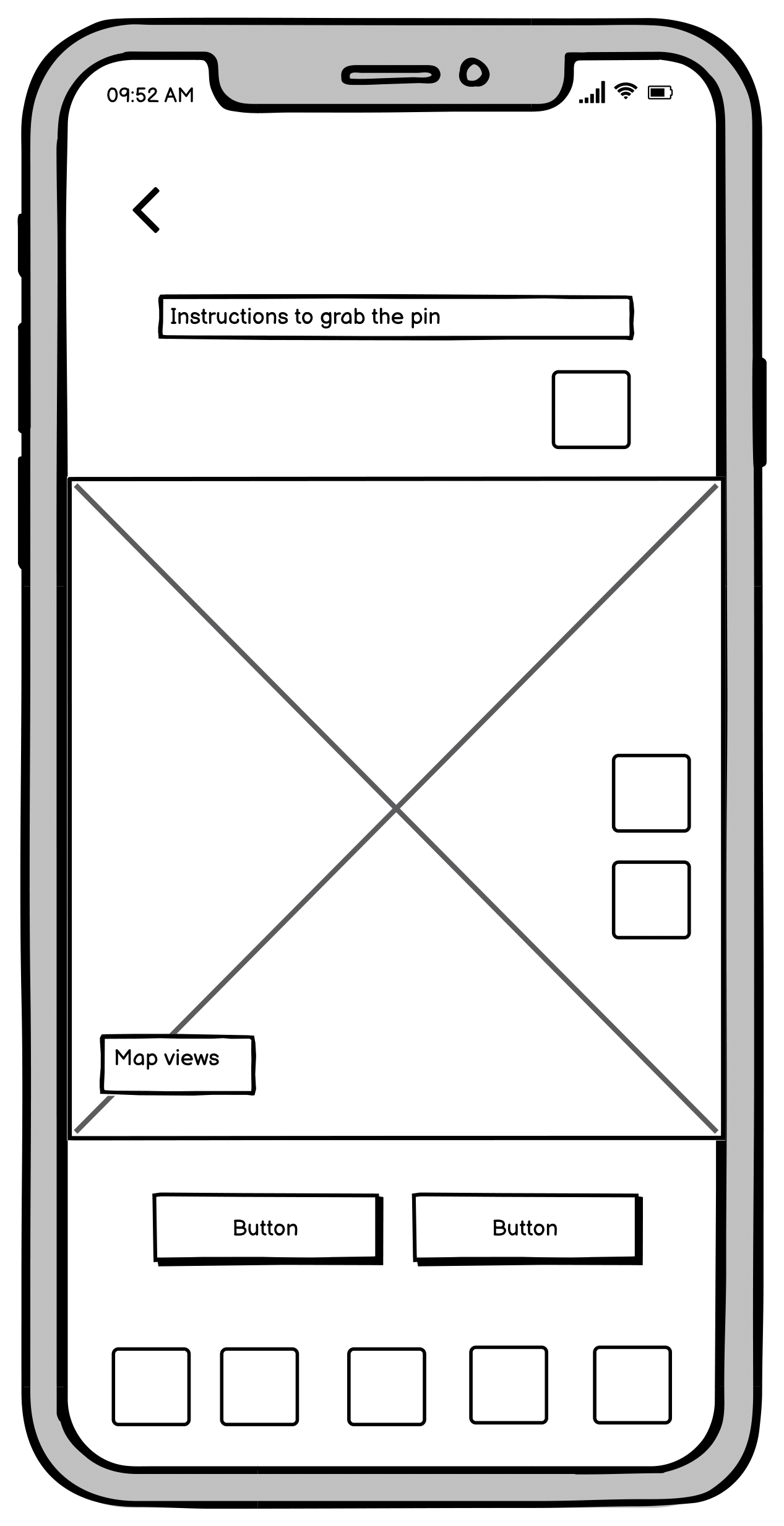
Drop pin

Confirm pin drop
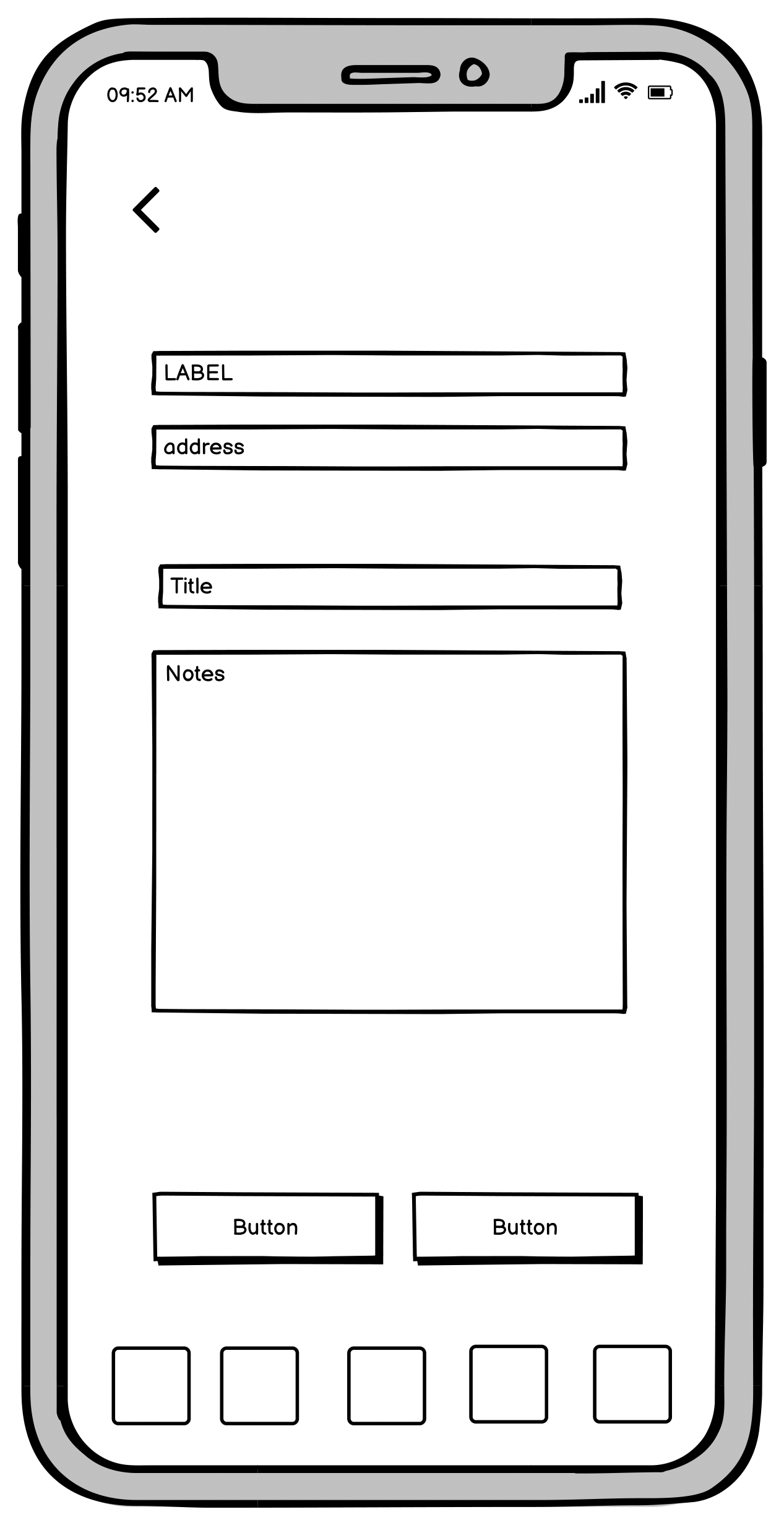
Label pin

Success
Mid-Fidelity
Next, I took the low-fi into a greyscale scheme to show button hierarchy, icons, and provide text to help testers navigate the prototype in testing.
Map home page
Search drop down
Pin instructions
Confirm
Label
Success
Usability Test Round 1
Overview
Six people ranging from 19 to 60 years old tested my prototype on Figma through zoom with remote access. The task given was to drop a pin by searching for an address and then complete the task by labeling the pin.
How did it go?
Everyone was able to complete the task. Common issues included:
- not familiar with a prototype
- button hierarchy on the first frame and hesitation seeing crime map
button
button
- the size of the map
- transitions to next screen ( fewer buttons, more use of autofill to
automatic load)
automatic load)
Considerations
- Explain how to interact with prototype testing and
keep testers on track with the task.
keep testers on track with the task.
- Restructure buttons and features on the map home page. Create a
layers button to include different views.
layers button to include different views.
- Increase the size of the map for easier interaction.
Revised Mid-Fidelity
Usability Testing Round 2
Overview
Five different people ranging from 19 to 60 years old tested the revised prototype on Figma through zoom with remote access. The task was kept the same. They were told to drop a pin by searching for an address and then complete the task by labeling the pin.
How did it go?
Everyone was able to complete the task. This round was better than the first round. Common issues included:
- icon confusion between the search icon and the plus sign on the first
frame
frame
- wanted a pin drop icon to click to make the map "active"
- didn't know to scroll with the categories list
Considerations
- Change the search icon to better express its feature to explore
nearby neighborhood recommendations.
nearby neighborhood recommendations.
- Remove the X and provide a pin icon to turn on and off for more play
with the map. Include undoing toggle.
with the map. Include undoing toggle.
- Park buttons on the category view so it provides a fast interaction after
the selection.
the selection.
High Fidelity
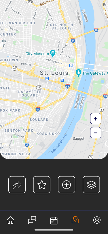
Map home
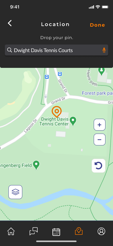
Create a pin
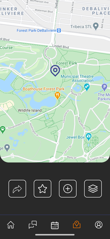
Pin dropped
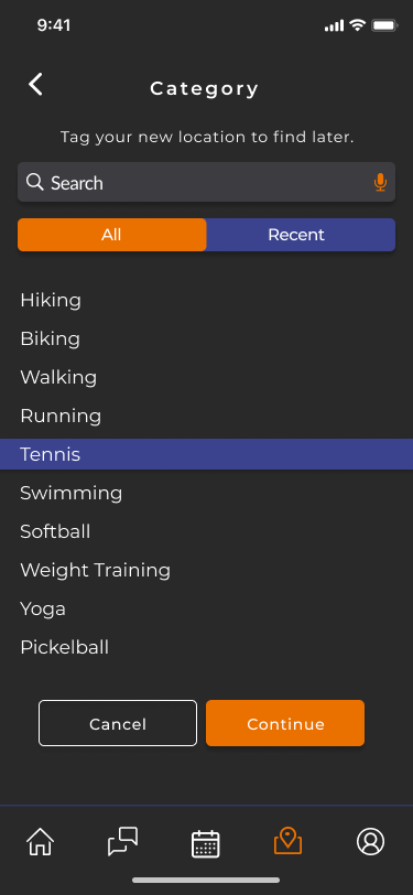
Category
Category selected
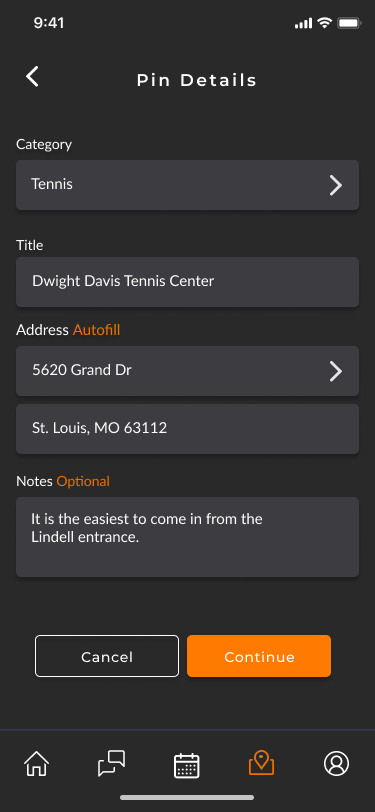
Pin details
Details added
Success
Prototype
To conduct usability testing, I created click-through prototypes a user interacted with to complete the assigned task.
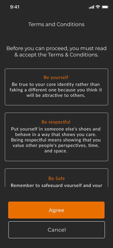
To create a life-like product that a tester could naturally respond to I had to consider the design more than I expected. Such as showing they filled in a form with fake content, displaying pop-up keyboards, and grouping elements of a button for a fluid click.
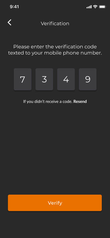
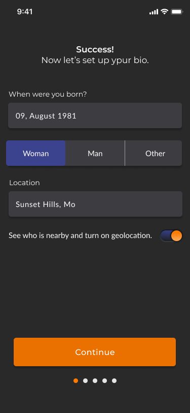
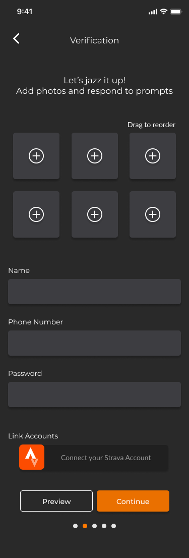
Onboarding and drop a pin
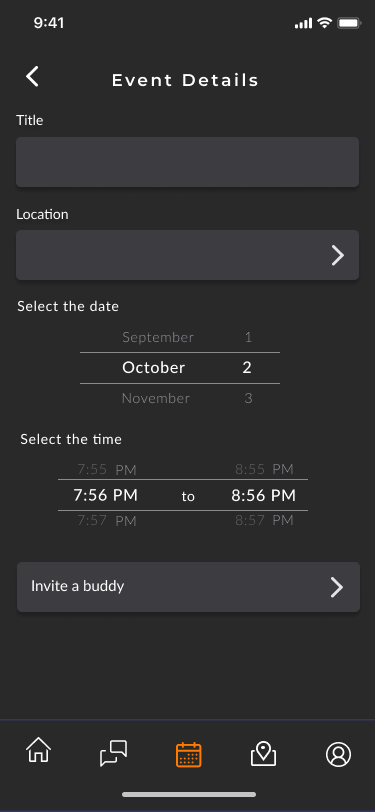
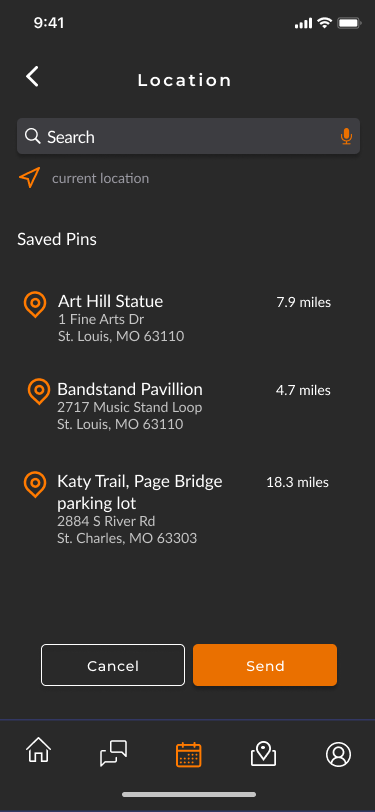
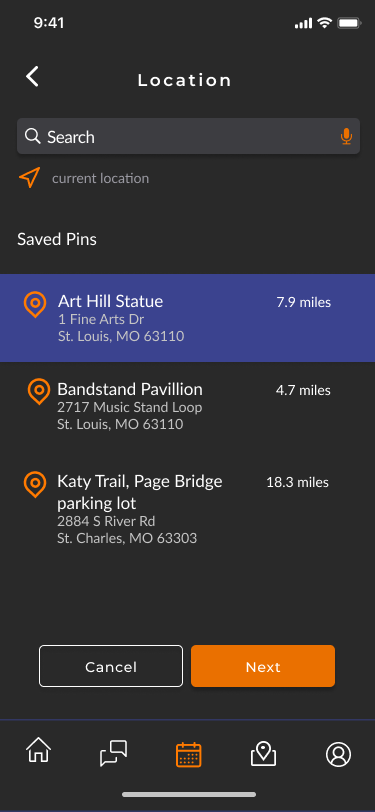
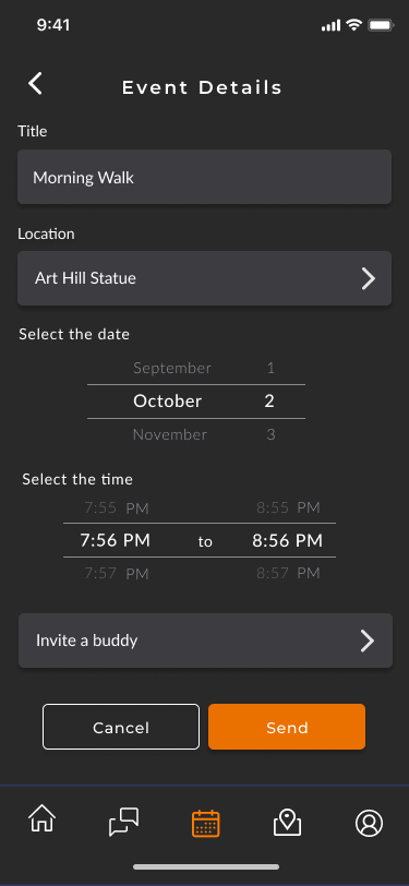
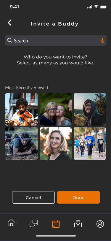
Revised pin drop and send invitation
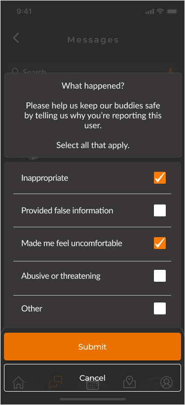
Report and change preferences
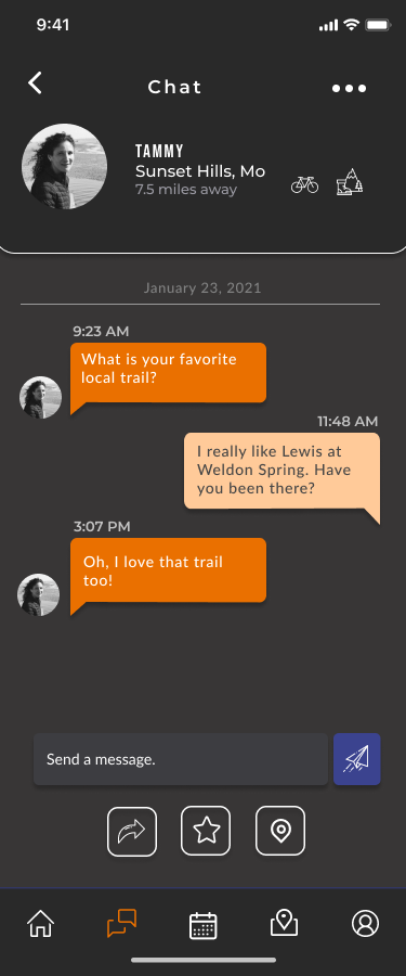
Send a message and report from thread
TEST
Usability Testing
Overview
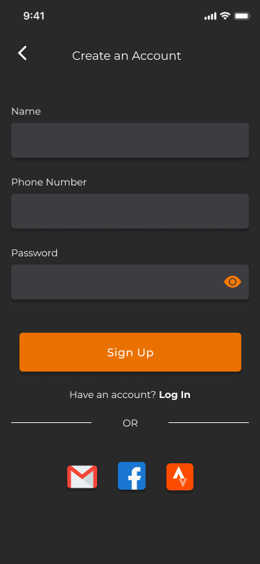
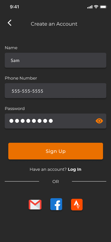
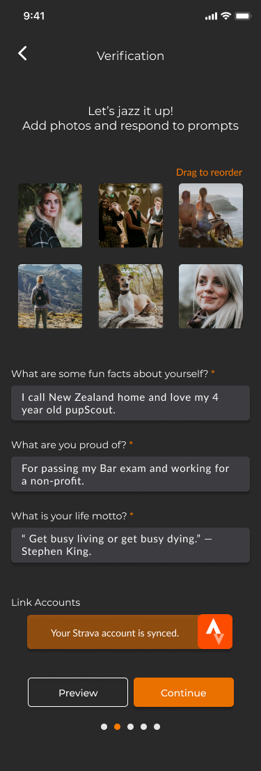
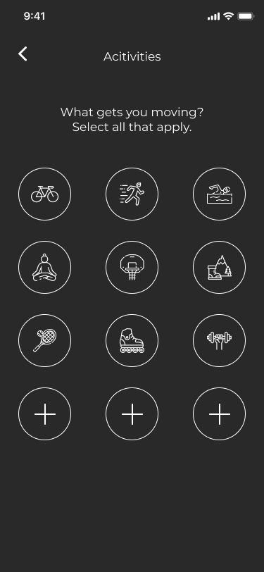
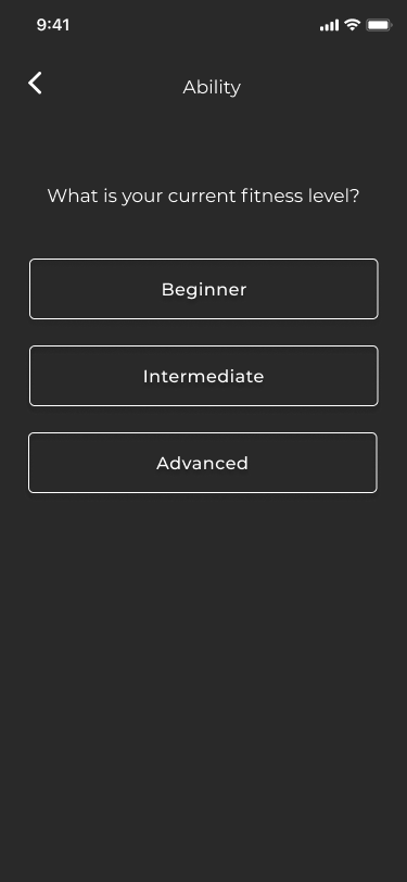
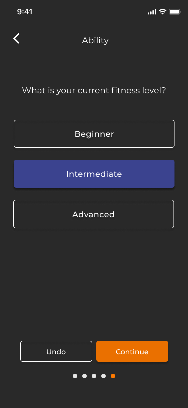
To find problems in my design, explore improvements, and better understand the users, I conducted user testing with 5 friends. There were given 6 tasks that demonstrated how to create an account, set up a profile, multiple ways to interact with users, and how to report a bad experience.
How did it go?
- 83% success rate for completion. Those that needed help were
confused by how to interact with the prototype or got off course
from the task presented ( users over 40 ).
confused by how to interact with the prototype or got off course
from the task presented ( users over 40 ).
- many found it straightforward, familiar, and easy to interact with
- found that testers needed text labels and/or instructions on the
screen to make confident choices
screen to make confident choices
- common issues involved navigation, scrolling, icon confusion, lack of
visual cues, and wanting additional text boxes.
visual cues, and wanting additional text boxes.
Considerations
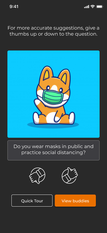
- Include an optional guided tour or hover points to provide interaction
tips and tricks.
tips and tricks.
- Replace the high-five icons on profiles to signal a messaging feature.
- Park buttons and allow content to scroll so the action is easy to access.
- Add a label with the arrow on the high-five pop up/down display
window for archived users.
window for archived users.
- Remove additional prompts from profile set-up and allow a user to
complete later.
complete later.
- Add a symbol to show what inputs are required.
Conclusion
What I Learned
1. One size does not fit all. I learned how to dig deeper into methods by
analyzing which method could be beneficial for the process. Throughout, I
learned that I was going to wear many hats.
analyzing which method could be beneficial for the process. Throughout, I
learned that I was going to wear many hats.
2. Be open-minded and listen. I found myself being stubborn with my concrete
ideas and was thinking digitally early on. I love usability testing now and look
forward to common pain points unfolding throughout testing.
ideas and was thinking digitally early on. I love usability testing now and look
forward to common pain points unfolding throughout testing.
3. Ask better questions. Looking back, I would conduct my interviews differently
and with a wider age range. My questions need to be less vague and structured
towards a more defined solution.
and with a wider age range. My questions need to be less vague and structured
towards a more defined solution.
What's Next
Next, I want to conduct more contextual interviews, usability testing, and refining to uncover additional pain points. One payoff was understanding the value of user research and organizing findings to create a product that is beneficial to users.
For the next level I want to include the following features:
- location list sharing abilities
- a button to provide tips on how to interact with the app
- a rating system based on experiences for authenticity
Final Screens


